Mastering Core Design Principles
- Arjit Sharma
- 05 Mins
- Product
Core design principles are the building blocks of effective UI/UX design. They ensure that digital interfaces are visually appealing, easy to navigate, and accessible.
Layouts
The layout defines how elements are arranged on a page to create a clear visual hierarchy and guide users through content effectively.
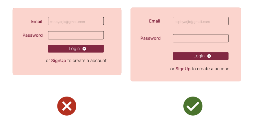
- Add More Spacing - One of the easiest ways to clean up a design is to simply give every element a little more room to breathe.
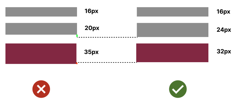
- Having a base unit makes designing simple. Example is using 8px base unit - 8px 16px 24px 32px and so on. All UI elements should be measured in increments of our base unit.
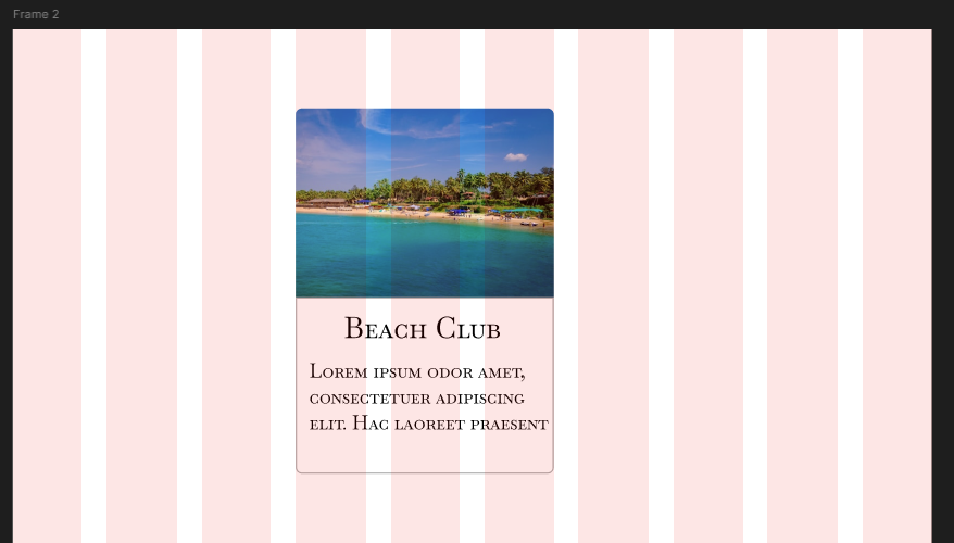
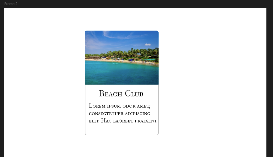
- A Grid is a framework used to arrange and align content and elements within a design, but do keep in mind that not everything in your layour is meant to be fluid. Take for example a sidenav.
-
Design for smaller devices first, then move to larger screens. Think in columns as well, something in smaller devices will have stacked columns but on larger screen can exist next to each other.
-
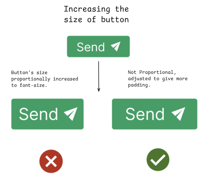
Relative sizing does’nt scale. Not every part of your interface has to be sized relative to one another ( shrinking one by 25%, also shrink other by 25%). Example - In first button even though proportions of font size and padding are preserved, but it gives more breathing space when we disproportionate padding for bigger font size.
- You don’t always have to fill the whole screen, spreading our design to fill screen width will only make it look worse.
Typography
Typography is all about techniques or arranging text to make written content readable and visually appealing. It innvolves selecting fonts type, style, spacing and laying it out to enhance user experience.
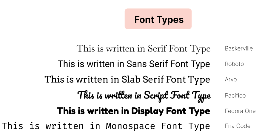
- About Typefaces and Fonts -
- Serif - Traditional and Formal
- Sans Serif - Modern and Clean
- Monospaced should be used in technical places, where each character has same space.
- Display should be used for Headlines, Titles.
- Script are handwritten styles
-
Picking the right font Choosing right font is critical as it sets the tone of design, communicates emotions, and reinforces brand identity. Fonts evoke feelings and perceptions ( Ex - using a serious font in error message like Roboto ). Stick to 2 or 3 fonts for cohesive design.
-
Establish a Type Scale to avoid inconsistencies. A modular scale (e.g., 3:4-rounded, 2:3-perfect fifth, or 1:1.618-golden ratio) helps define font sizes based on a base value (e.g., 16px). Applying the chosen ratio gives the next sizes (16 → 16 × 1.618 = 25.8px).
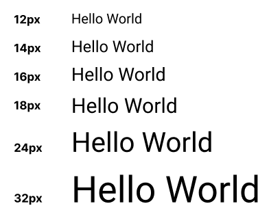
However, in practice, some manual adjustments are often needed to match design needs. Instead of strictly following a formula, define a consistent set of font sizes in advance.
Example: 12px → 14px → 16px → 18px → 24px → 32px
 Note - Also make sure to stick to rem or px, because em units are relative hence will lead to inconsistencies.
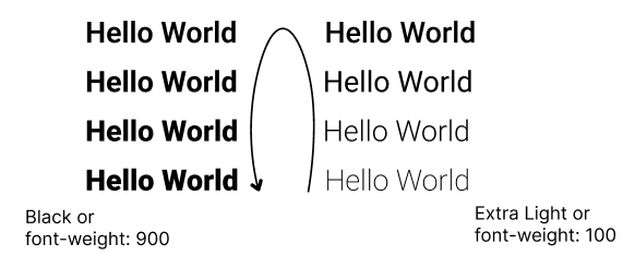
- Font Weight Scale ensures consistency and hierarchy. Use 400 (Regular) for body text, 500–600 (Medium/Semi-Bold) for subheadings, and 700+ (Bold/Black) for emphasis. This keeps typography structured and readable.
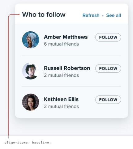
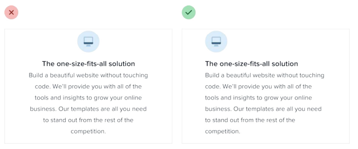
- Keep your line length, line height and baselines in check Line length refers to the width of a text block. Recommended length is 45-47 characters per line. Baseline is the imaginary line where text sits, when using multiple fonts in 1 line, align it to baseline instead of vertical align for cleaner look. Line Height is vertical spacing between lines, ideally set at 1.5, but is inversely proportional to font size ( For large text keep line height smaller )
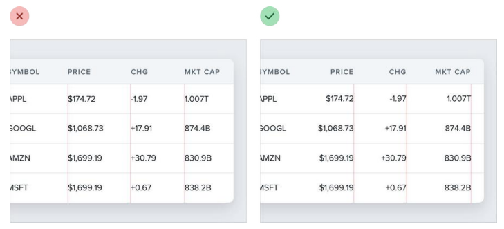
- Better to left align long form text and right align numbers.
Color
A well-chosen color palette enhances the visual appeal of an interface while improving usability and accessibility.
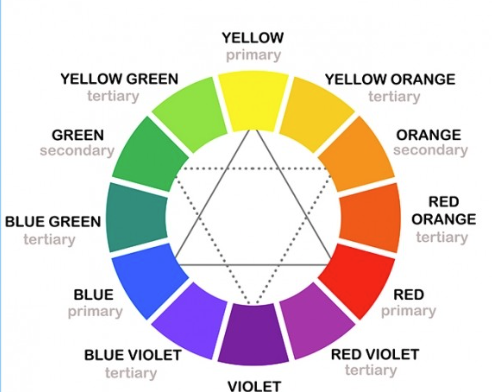
- Color Theory Basics : Color theory is built on primary colors (red, blue, yellow), which mix to form secondary colors (green, orange, purple) and further blend to create tertiary colors (e.g., blue-green). The color wheel is a circular representation of these relationships, helping designers visualize complementary (opposite), analogous (adjacent), and monochromatic (variations of one color) schemes to achieve balance and contrast in their designs.
-
Colors are represented in formats like RGB ( e.g., rgb(255,0,0) ), HEX (web-friendly, e.g., #FF0000), and HSL (intuitive for adjustments, e.g., hsl( e.g., hsl(0,50%,50%) ). Use HEX/RGB for digital, HSL for fine-tuning
-
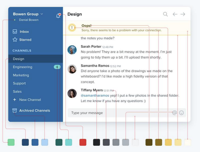
You need way more colors than you think, so building a color palette involves extending main palette to have multiple variations of same color. Steps to remember while building a palette -
- Primary colors of your site ( maybe 2 colors ), these determine overall look of the site.
- Accent colors that are eye-grabbing like yellow(for warnings), red(for dangers), green(for positive trends), pink or teal etc
- Have 8-10 shades of grey as they are used everywhere from texts to backgrounds and forms.
Imagery and Iconography
Imagery, including photos, illustrations, and icons, enhances visual appeal and aids in communication.
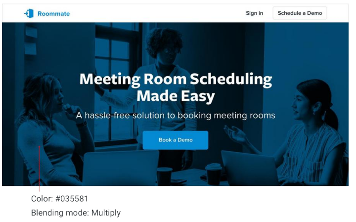
- Text on Images - Text needs consistent contrast, a simple way to do this would be using a overlay. Other ways are to add are linear gradient, lower image contrast, colorize the image or add a text shadow.

-
- Icons should be scalable and consistent, avoiding excessive resizing that can distort clarity. SVG is the preferred format for sharpness and responsiveness, while PNG is suitable for fixed-size icons if optimized. This is obvious but to re-iterate icons should follow a uniform style (e.g., filled, outlined).
Accessibility
Accessibility ensures that digital interfaces are usable by everyone, including people with disabilities. It should be ingrained in the way we think.
- High color contrast (e.g., black text on a white background) improves readability,
- Larger touch targets (e.g., buttons at least 44x44px) help users with motor impairments.
- Alt text for images ensures screen readers can describe visuals, and keyboard navigation (e.g., using the Tab key to move between buttons) makes interactions smoother for users who can’t use a mouse.
- Adding ARIA labels to icons (e.g.,
<button aria-label="Search">🔍</button>) helps screen readers convey meaning.